Read part one: Building Bonfire Native Apps with LiveView Native
With our initial mockups complete, we were eager to start coding in LiveView Native (LVN). There are two primary ways to debug an iOS app: using Xcode or LVN Go. LVN Go is an application available on macOS, iPad, and iPhone that allows you to test a LiveView Native app directly on a device by pointing it to the Phoenix server URL.
We chose to use Xcode because we need to build custom SwiftUI views in the future for our specific use case.
For reference, I'm using Xcode beta with the iPhone 16 simulator running iOS 18 on macOS Sequoia, and live_view_native_swiftui version 0.3.0.
iOS 17 should work fine as well; however, I experienced some SwiftUI errors with older versions.
I followed the tutorial from the DockYard blog post to set up a basic LiveView Native app.
Adding LVN is quite straightforward, though there are still some tweaks that need to be done manually, such as editing the dev.exs file. Nonetheless, the experience is already pretty smooth!
To debug my app, I needed to run the project on Xcode. Fortunately, the basic code to set up the SwiftUI app and connect to the Phoenix server is automatically generated when running the mix lvn.setup.gen task.
I just had to open the project by running:
open native/swiftui/Counter.xcodeprojXcode begins fetching dependencies and may trigger some errors. Enabling permissions for plugins used by LiveView Native, as outlined in the official guide, solves all of them.
At this point, I was ready to build and run the app on the iPhone simulator.
Understanding SwiftUI and LVN #
One of the challenges I encountered was wrapping my head around the SwiftUI way of building interfaces and then translating that back to LVN. I found myself frequently switching between the SwiftUI documentation and the LiveView Native SwiftUI syntax conversion guide.
Other resources I found useful were the LVN CookBook (a collection of useful design patterns) and the Lax GitHub repository (a minimal Slack clone built with LVN).
Leveraging AI and Community Support #
There were some parts I still need to understand better, but using AI tools like Claude 3.5 sonnet and GPT-4o often helped in navigating component design in SwiftUI and translating SwiftUI code into LVN. When I wasn't able to do it on my own, the LiveView Native slack community was very supportive.
Prototyping Components #
At this point, I just wanted to get a feel of how to build native components in LVN, before starting to build the main pages of the app. I ended up prototyping a few components that are trasversal to the main views of the Bonfire iOS app, such as the Dropdown Menu and the Modal.
Dropdown Menu #
LVN includes the SwiftUI default Menu component:
<Menu>
  <Text template={:label}>Edit Actions</Text>
  <Group template={:content}>
    <Button phx-click="arrange">Arrange</Button>
    <Button phx-click="update">Update</Button>
    <Button phx-click="remove">Remove</Button>
  </Group>
</Menu>
The unfamiliar bit for me here was the template prop on both Text and Group.
In SwiftUI, the Menu struct requires both a label and content parameter, which are closures returning the views to be displayed in the menu component:
struct Menu<Label, Content> where Label: View, Content: ViewIn LVN, when a SwiftUI struct or modifier expects a closure or a content view (like content, label, footer, etc.), we use the template attribute to link a child view to that modifier's parameter.
I further customized the menu by including icons next to each menu item and adding a divider to separate different groups of content. The final component looks like this:
<Menu>
  <HStack template={:label} style="tint(.black)">
    <Text style="font(.body);">Following</Text>
    <Image systemName="chevron.down.circle.fill" style="padding(.leading, 2);"/>
  </HStack>
  <Group template={:content}>
    <Button><Label systemImage="house">Home</Label></Button>
    <Button><Label systemImage="eye">Following</Label></Button>
    <Button><Label systemImage="person.2">Local</Label></Button>
    <Button><Label systemImage="globe">Remote</Label></Button>
    <Divider/>
    <Button phx-click="show_filters"><Label systemImage="line.3.horizontal.decrease.circle">Filters</Label></Button>
  </Group>
</Menu>
Modal / Sheet #
LiveView Native includes a default modal among other components in the core_components file. It is a simple VStack with a sheet modifier. The sheet modifier accepts an isPresented value to toggle visibility, a :content view, and an onDismiss callback. The code looks like this:
def modal(assigns) do
  ~LVN"""
  <VStack
    id={@id}
    :if={@show}
    style='sheet(isPresented: attr("presented"), content: :content)'
    presented={@show}
    phx-change={@on_cancel}
  >
    <VStack template="content">
      <%= render_slot(@inner_block) %>
    </VStack>
  </VStack>
  """
end
Customizing the Modal #
I wanted to further refine the modal by tweaking its size, including a drag indicator, and changing the background.
Specifically, I wanted to:
- Make the modal initially occupy half the size of the screen.
- Include a drag indicator.
- Allow it to expand or dismiss completely.
- Replace the default background color with a translucent one.
The final result looks like this:
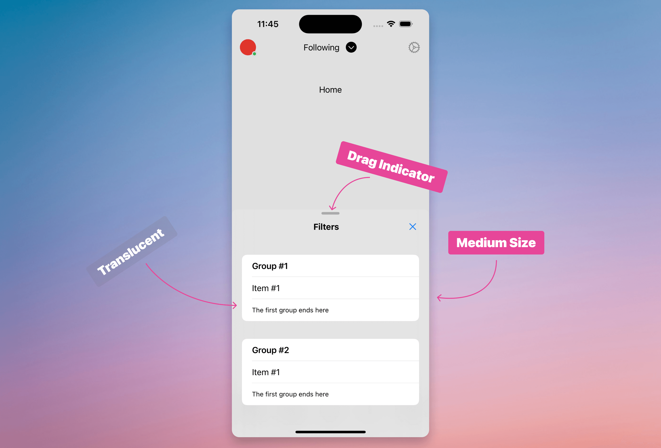
(It's not easy to notice the translucent effect due to the flat background color behind the modal.)
To achieve this result, I included a few custom classes in the VStack's :content template.
Note: It took me some time, along with assistance from the LVN team, to realize that the classes should be applied not to the main sheet component, but to the child VStack with the :content template. This is a key detail from the SwiftUI API.
<VStack class="detents:medium:large ultrathinmaterial dragindicator:visible" template={:content}>Classes are an alternative way to add modifiers. They can combine multiple modifiers to create easy-to-use and standard components, and they can be chained together—much like Tailwind CSS.
Defining Custom Classes #
In my app.swiftui.ex file, I've defined the classes used above:
~SHEET"""
"dragindicator:" <> do
  presentationDragIndicator(.{props})
end

"ultrathinmaterial" do
  presentationBackground(.ultraThinMaterial)
end
"""

def class("detents:" <> props) do
  [start, end] = String.split(props, ":")
  ~RULES"""
    presentationDetents([.{start}, .{end}])
  """
end
And that's it!
What's Next? #
In the next entry, we will start defining the views for the main pages outlined in our mockups, build the main components for each of them, and navigate between pages using the TabView component and links.
Stay tuned!

