Read part one: Building Bonfire Native Apps with LiveView Native
Read part two: Prototyping Our First Native Components with LiveView Native
Note: This entry may evolve over time as the LiveView Native team pushes improvements and releases major versions of the libraries. Please bear with us as we test and implement the main navigation patterns in our upcoming Bonfire native app! Also, this article reflects our current understanding of SwiftUI and LiveView Native; we would love to get feedback and improve any parts that are not accurate!
Thanks to the LiveView Native team for their feedback and support! 🔥
In our previous article, we experimented with building some simple UI components that we'll be using across the Bonfire app, and at the same time, we've developed some initial confidence in writing LiveView Native (LVN) code.
Today, we'll go through the implementation of the main navigation patterns needed to traverse our app's sections and views.
LiveView Native Navigation #
In SwiftUI, there are three main ways to navigate an app:
- Tab Bar
- Navigation Bar
- Links
The destination can be a different section in the same view, a different page, a sheet (modal), or an external view.
In LiveView Native, all the routing and navigation happens within the NavigationStack view, which is included by default in the root.swiftui.leex and wraps all the views defined in the router.ex module.
The LVN documentation is a great starting point to learn more about how navigation works:
The TabView #
The TabView is a default SwiftUI component fixed at the bottom of a view. It consists of up to five navigation items (icons only or icons with text—although text is usually recommended if you're showing a maximum of three buttons) and is used for top-level navigation between major sections of a single view.
In SwiftUI, the TabView is defined as:
TabView: A view that switches between multiple child views using interactive user interface elements.
To include a TabView in LVN, we need to use the default <TabView> component.
The Lax repository provides a couple of custom components to implement a TabView in an elegant and simple way—we copy-pasted them into our app in no time 🥸️️️️️️ !
attr :rest, :global, include: ~w(phx-change selection)
slot :inner_block, required: true

def tab_bar(assigns) do
~LVN"""
  <TabView {@rest}>
    <%= render_slot(@inner_block) %>
  </TabView>
"""
end

attr :tag, :any, required: true
attr :name, :string, required: true
attr :icon_system_name, :string, required: true
slot :inner_block, required: true

def tab(assigns) do
	~LVN"""
	<Group tag={@tag} style="tabItem(:tab);">
	  <Image template={:tab} systemName={@icon_system_name} />
	  <Text template={:tab}><%= @name %></Text>
	  <%= render_slot(@inner_block) %>
	</Group>
	"""
end
Then we just had to import them into our view like this:
<VStack>
  <.tab_bar phx-change="swiftui_tab_selection" selection={@swiftui_tab}>
    <.tab tag={:home} name="" icon_system_name="square.stack">
      <Text>Home</Text>
    </.tab>

	<.tab tag={:notifications} name="" icon_system_name="bell">
		<Text>Notifications</Text>
	</.tab>

	<.tab tag={:search} name="" icon_system_name="magnifyingglass">
		<Text>Search</Text>
	</.tab>

	<.tab tag={:direct_messages} name="" icon_system_name="tray">
		<Text>DMs</Text>
	</.tab>

	<.tab tag={:profile} name="" icon_system_name="person.crop.circle">
		<Text>Profile</Text>
	</.tab>
</.tab_bar>
</VStack>
And this is the result:
Note: Currently, you can include only functional components as slots within each
<.tab>. It is not possible to include sub-LiveViews—this may evolve with future releases of the LiveView Native Core library.
The TabView is mostly this; it resembles the standard <Tabs> web design pattern: it lets the user navigate different content of the same page, highlighting the currently active <Tab> component.
The Toolbar Navigation #
We found the toolbar navigation trickier to implement, probably because of the various user experiences and customizations we required.
Note: We highly recommend the article How to Create Toolbar in SwiftUI to learn more about the different types of actions and properties you can leverage to build the toolbar.
In our case, our main issue consisted of having to switch between three different types of toolbars based upon the current active page.
As mentioned earlier, the <TabView> component only accepts functional components as slots for each <Tab>. Additionally, we can only define a single <Toolbar> for each view.
This means that based on the active tab, we need to programmatically change the toolbar structure to customize it according to the needs of the rendered component.
As far as we know, the current version of LVN doesn't include all the Optimistic UI features that are built into LiveView—or maybe it's just us doing something weird—but we are experiencing a few minor bugs when trying to programmatically edit the toolbar when props change.
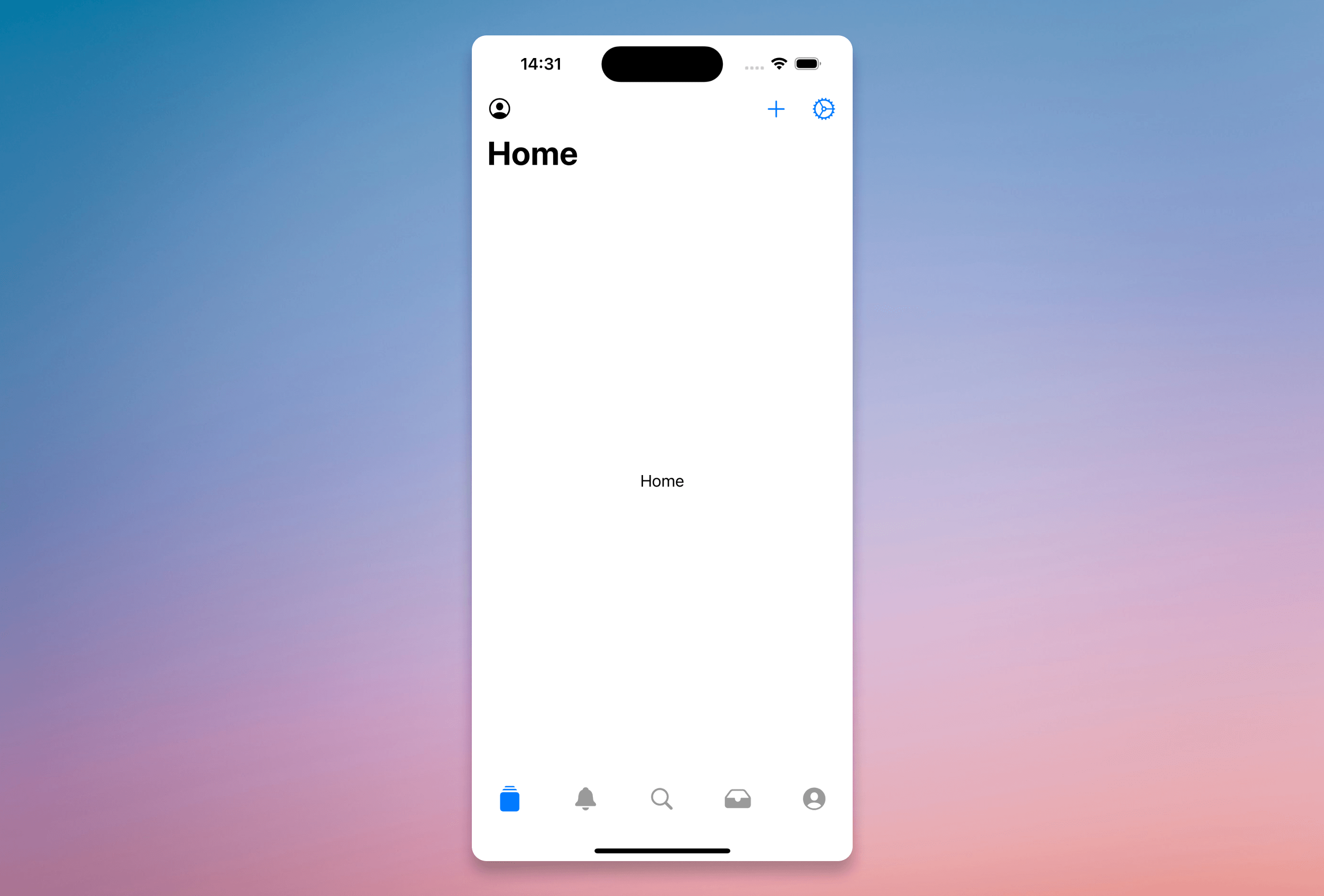
To add a basic toolbar, which includes only the navigation title, all you need is to include this code in your main view:
<VStack style={"navigationTitle(:title);"}>
	<Text template={:title}>Home</Text>
</VStack>
This will add the standard iOS navigation title at the top of your view like:
From there, we can go further and add buttons at the top left and right, add the search bar, add an extra dropdown menu next to the title, change the position of the title, or edit the background.
We will need to apply all of the above in order to build toolbars like these:
iOS Toolbar provides ways for adding items and buttons on both the left and right. This is done by adding a ToolbarItem (or ToolbarItemGroup if you need to wrap more actions in the same component) and specifying a placement attribute. In order to add a ToolbarItem/ToolbarItemGroup in our toolbar, we need to specify it by including the toolbar modifier in our parent VStack: toolbar(content: :toolbar)
Our code now looks like:
<VStack
	style={[
	  "navigationTitle(:title)",
	  "toolbar(content: :toolbar)"
	  ]}>
	<Text template={:title}>Home</Text>
</VStack>
This change alone is not enough though; we need to actually add the items we want to render.
<VStack
style={[
"navigationTitle(:title)",
"toolbar(content: :toolbar)"
]}>
<Text template={:title}>Home</Text>
<ToolbarItemGroup template="toolbar" placement="navigationBarTrailing">
<Button>
<.icon name="plus" />
</Button>
. <Button>
<.icon name="gear" />
</Button>
</ToolbarItemGroup>
<ToolbarItem template="toolbar" placement="navigation">
<.icon name="person.crop.circle" />
</ToolbarItem>
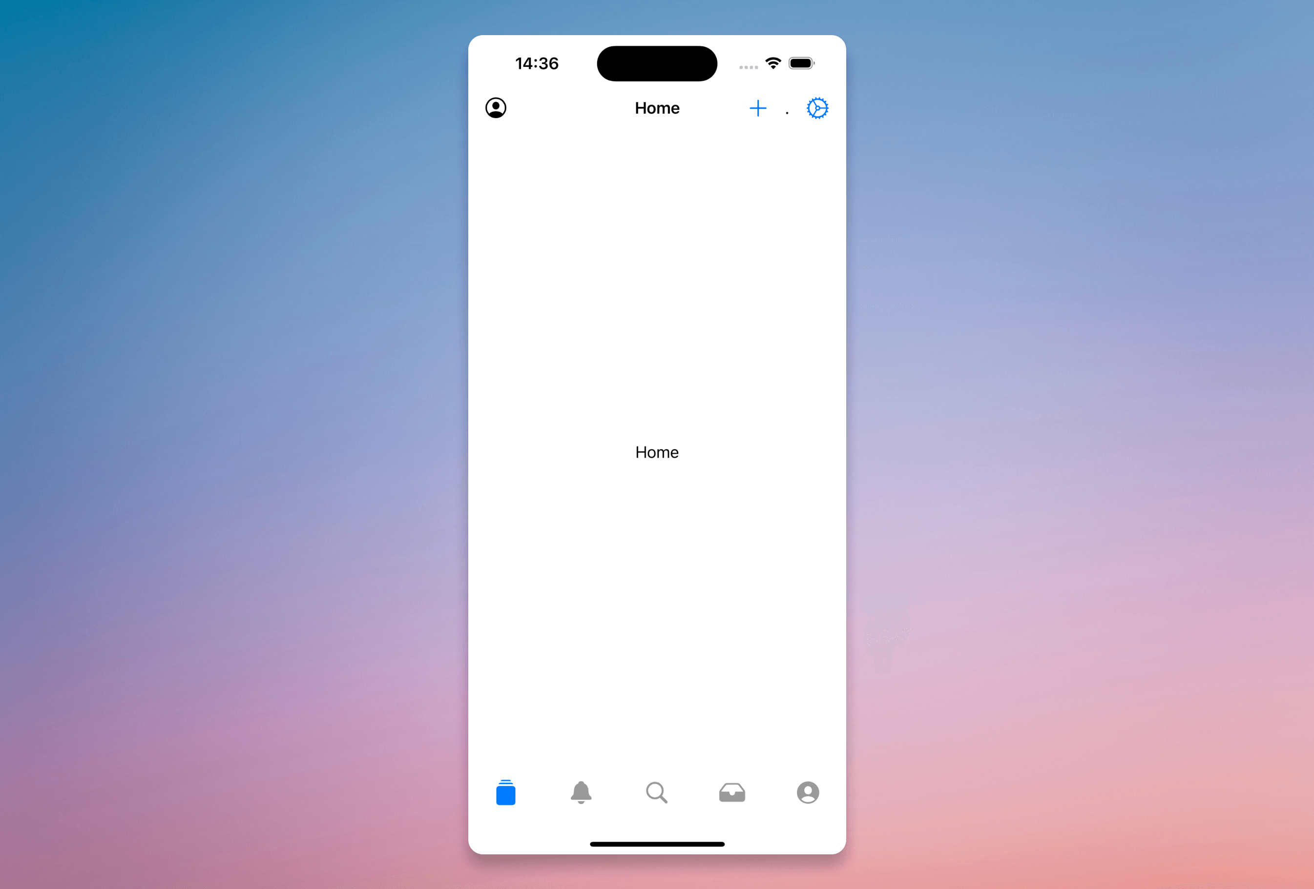
</VStack>The navigationBarTrailing placement allows us to show the actions on the right side of the toolbar; using navigation places them on the left side.
The toolbar now looks like:
Getting better....
But we don't want the title that big, and we want to center it in the middle of the toolbar.
We have two possibilities:
- Using
navigationBarTitleDisplayMode(.inline): This moves the title to the center of the toolbar and reduces the font size at the same time. - Using a
ToolbarItemwithplacement="principal": Insert a<Text>into it with the page title.
If we use the latter option, we should remove the <Text template={:title}>Home</Text> from the template.
Here's the updated code:
<VStack
	style={[
	  "navigationTitle(:title)",
	  "toolbar(content: :toolbar)",
	  "navigationBarTitleDisplayMode(.inline)"
	  ]}>
	<Text template={:title}>Home</Text>
	<ToolbarItemGroup template="toolbar" placement="navigationBarTrailing">
	  <Button>
		<.icon name="plus" />
	  </Button>
	. <Button>
		<.icon name="gear" />
	  </Button>
	</ToolbarItemGroup>
	<ToolbarItem template="toolbar" placement="navigation">
		<.icon name="person.crop.circle" />
	</ToolbarItem>
</VStack>
et voilà...
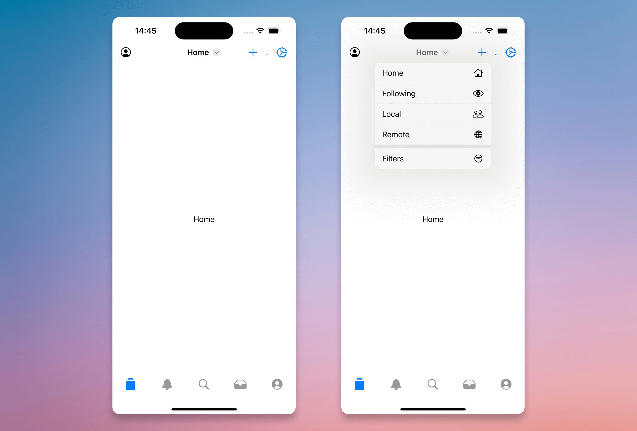
The missing piece for our first toolbar, which we can implement using the toolbarTitleMenu modifier, is adding a dropdown menu next to the title:
<VStack
style={[
"navigationTitle(:title)",
"toolbar(content: :toolbar)",
"navigationBarTitleDisplayMode(.inline)"
]}>
<Text template={:title}>Home</Text>
<ToolbarItemGroup template="toolbar" placement="navigationBarTrailing">
<Button>
<.icon name="plus" />
</Button>
. <Button>
<.icon name="gear" />
</Button>
</ToolbarItemGroup>
<ToolbarItem template="toolbar" placement="navigation">
<.icon name="person.crop.circle" />
</ToolbarItem>
<VStack template="content">
<.button><Label systemImage="house">Home</Label></.button>
<.button><Label systemImage="eye">Following</Label></.button>
<.button><Label systemImage="person.2">Local</Label></.button>
<.button><Label systemImage="globe">Remote</Label></.button>
<Divider/>
<.button phx-click="show_filters"><Label systemImage="line.3.horizontal.decrease.circle">Filters</Label></.button>
</VStack>
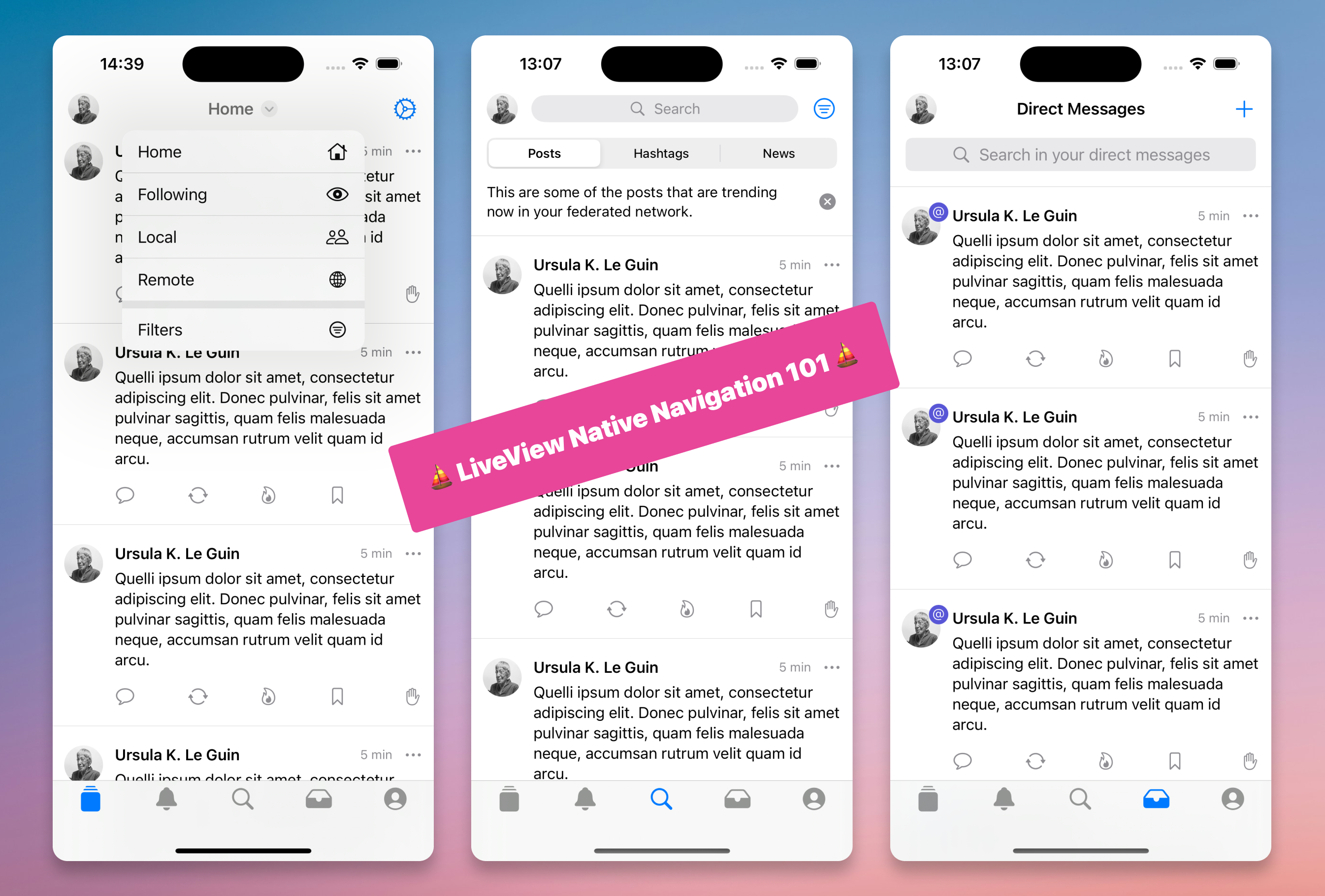
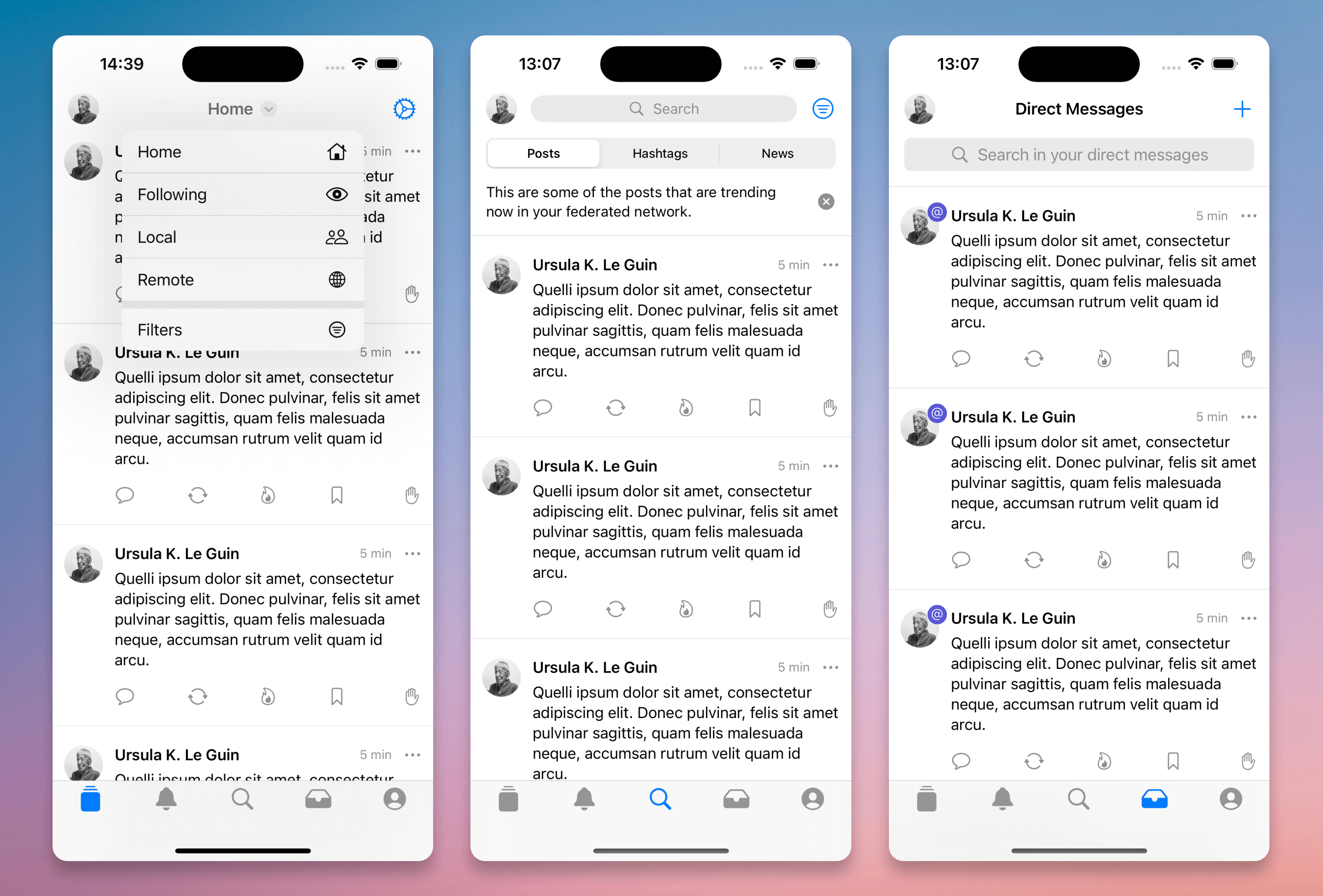
</VStack>And here's how it looks:
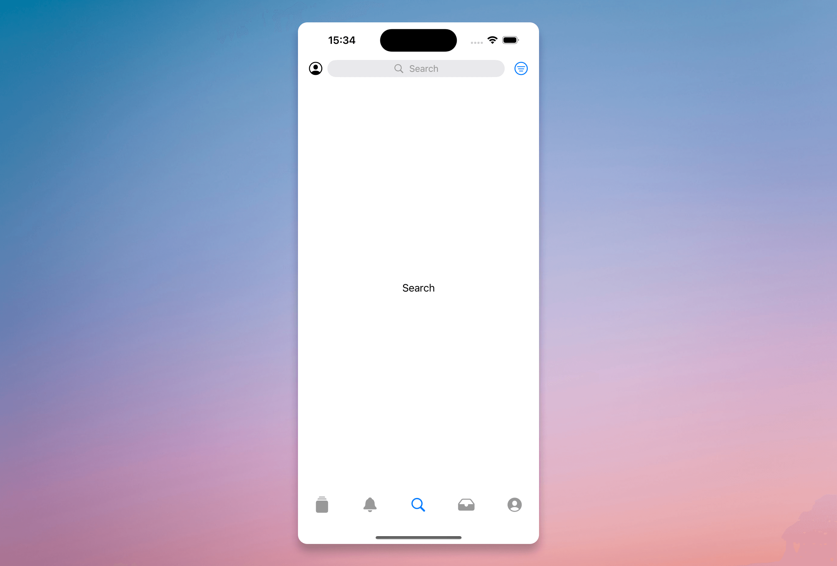
When the Search tab is active, we want to remove the title from the toolbar and display a button that redirects the user to the search page. Meanwhile, the rest of the page shows trending search results or other default content. This is a common pattern we observed in several social network apps like the Mastodon iOS app, IceCubes (an alternative Mastodon iOS client), and X (btw are you still relying on X as your main social presence? If so, you may want to consider moving your main presence over the fediverse, it's a way less toxic environment and not owned by a megalomaniac idiot 🔥️️️️️️).
The code to build the Search Toolbar is as follows:
<VStack
  style={[
	"navigationTitle(:title)",
	"toolbar(content: :toolbar)",
	"navigationBarTitleDisplayMode(.inline)"
  ]}>
	<ToolbarItem template="toolbar" placement="principal">
		<Button phx-click="go_to_search" style={[
			"frame(maxWidth: .infinity)",
			"controlSize(.small)",
			"foregroundStyle(.gray)",
			"buttonStyle(.bordered)"]}>
			<HStack style="frame(maxWidth: .infinity)">
				<.icon name="magnifyingglass" />
				<Text>Search</Text>
			</HStack>
		</Button>
	</ToolbarItem>
	<ToolbarItemGroup template="toolbar" placement="navigationBarTrailing">
		<Button><.icon name="gear" /></Button>
	</ToolbarItemGroup>
	<ToolbarItem template="toolbar" placement="navigation">
		<.icon name="person.crop.circle" />
	</ToolbarItem>
	<VStack template="content">
		<.button><Label systemImage="house">Home</Label></.button>
		<.button><Label systemImage="eye">Following</Label></.button>
		<.button><Label systemImage="person.2">Local</Label></.button>
		<.button><Label systemImage="globe">Remote</Label></.button>
		<Divider/>
		<.button phx-click="show_filters">
			<Label systemImage="line.3.horizontal.decrease.circle">Filters</Label>
		</.button>
	</VStack>
</VStack>
Resulting in:
Since each tab has different buttons and items to display on the toolbar, and we can only include one toolbar per view, we needed a way to programmatically edit the toolbar based on the active tab.
We ended up defining a Header component, using slots for the different sections.
Here is the final code:
attr :style, :any
attr :show_search, :boolean, default: false
attr :page_title, :string, default: ""
slot :toolbar_trailing
slot :navigation_menu
slot :header_menu

def main_header(assigns) do
~LVN"""
  <VStack style={@style}>
	<%= if @show_search do %>
	  <ToolbarItem template="toolbar" placement="principal">
		<Button phx-click="go_to_search"
		  style={[
		  "frame(maxWidth: .infinity)",
		  "controlSize(.small)",
		  "foregroundStyle(.gray)",
		  "buttonStyle(.bordered)"]}>
			<HStack style="frame(maxWidth: .infinity)">
			  <.icon name="magnifyingglass" />
			  <Text>Search</Text>
		    </HStack>
		</Button>
	  </ToolbarItem>
	<% else %>
	  <Text template="title"> <%= @page_title %></Text>
	<% end %>
	<ToolbarItemGroup template="toolbar" placement="navigationBarTrailing">
	  <%= render_slot(@toolbar_trailing) %>
	</ToolbarItemGroup>
	<ToolbarItemGroup template="toolbar" placement="navigation">
	  <%= render_slot(@navigation_menu) %>
	</ToolbarItemGroup>
	<VStack template="content">
	  <%= render_slot(@header_menu) %>
	</VStack>
</VStack>
"""
end
This is more Elixir than SwiftUI! 😊
In our home_live.ex, we already have a handle_event function responsible for updating the swiftui_tab value based on the tab bar's phx-change="swiftui_tab_selection" event.
We added more logic to render different components in the header slots based on the active tab.
The remaining task was to define the correct modifiers to apply to the toolbar struct. We experienced some issues while trying to update the modifiers array directly in the template or even in the handle_params function.
For example, doing something like this did not seem to work:
<VStack
	style={[
	~s[toolbar(content: :toolbar)],
	~s[navigationTitle(:title)],
	~s[navigationBarTitleDisplayMode(.inline)],
	~s[toolbarBackground(.visible, for: .navigationBar)],
	~s[toolbarBackground(.ultraThinMaterial, for: .navigationBar)]
	] ++ if @show_header_menu, do: [~s[toolbarTitleMenu(content: :content)]], else: []}>
Even though the props were correctly added to the modifiers array. (Brian Carderella pointed out that these small issues will likely be resolved when the LiveView Native core library refactor is completed 🎉)
We achieved our goal by wrapping the style in two different classes and conditionally switching between them based on the props.
We've added these two classes:
def class("main_header") do
~RULES"""
	toolbar(content: :toolbar)
	navigationTitle(:title)
	toolbarTitleMenu(content: :content)
	navigationBarTitleDisplayMode(.inline)
	toolbarBackgroundVisibility(.visible, for: .navigationBar)
	toolbarBackground(.ultraThinMaterial, for: .navigationBar)
"""
end

def class("simple_header") do
~RULES"""
	toolbar(content: :toolbar)
	navigationTitle(:title)
	navigationBarTitleDisplayMode(.inline)
"""
end
And finally, in our home_live.swiftui.neex
<.main_header
  page_title={@page_title}
  show_search={@show_search}
  style={if @show_header_menu, do: "main_header", else: "simple_header"}
  <:toolbar_trailing>
	<%= case @toolbar_trailing do %>
		<% :home_toolbar_trailing -> %>
		  <.home_toolbar_trailing />
		<% :notifications_toolbar_trailing -> %>
		  <.notifications_toolbar_trailing />
		<% :search_toolbar_trailing -> %>
		  <.search_toolbar_trailing />
		<% :profile_toolbar_trailing -> %>
		  <.profile_toolbar_trailing />
		<% :direct_messages_toolbar_trailing -> %>
		  <.direct_messages_toolbar_trailing />
		<% _ -> %>
    <% end %>
  </:toolbar_trailing>
  <:navigation_menu>
	<%= case @navigation_menu do %>
		<% :profile_navigation_menu -> %>
			<VStack></VStack>
		<% _ -> %>
			<.navigation_menu />
	<% end %>
  </:navigation_menu>
  <:header_menu>
	<%= case @header_menu do %>
	  <% :home_header_menu -> %>
		<.home_header_menu />
	  <% :notifications_header_menu -> %>
		<.notifications_header_menu />
	  <% :search_header_menu -> %>
	  <% _ -> %>
	<% end %>
  </:header_menu>
</.main_header>
This is what the result looks like:
We can optimize the code by using a single class and concatenating dynamic props, something along the lines of:
def class("main_header:" <> props) do

~RULES"""
  ...
"""
end
Additionally, we can use push_patch to remember the current tab when navigating back to previous page from the Search view. We also need to iron our understanding about how SwiftUI handles the navigation stack.
We'll continue this work in the next article, where we'll clean up the code and make it more robust. We'll also try to include some transition effects to change the header content when scrolling down the profile page.
From the next article, all the code will be pushed to our GitHub, making it easier for contributors to read and navigate the code.

